James Gin
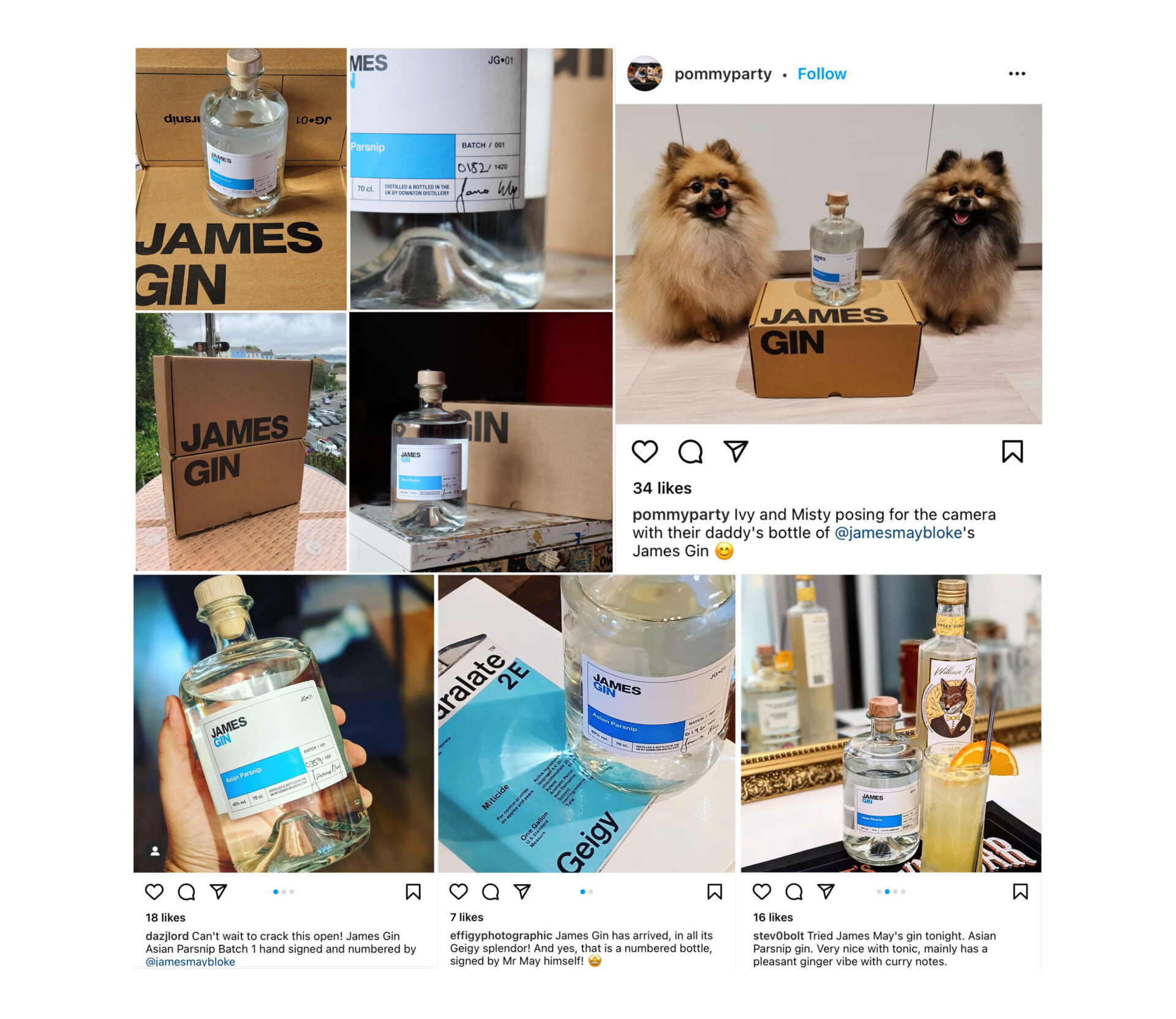
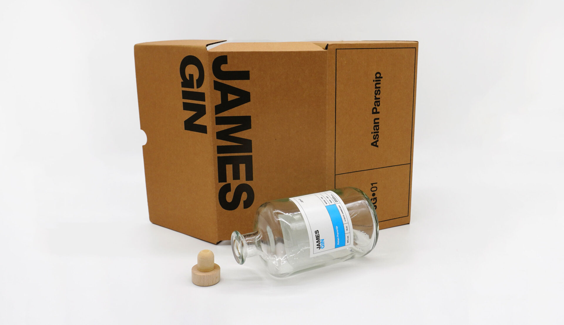
James May’s team originally approached us to come up with some ideas for a bottle, a label and a box design for what was initially to be a small batch gin.
The brief was to keep it as simple as possible, there was to be no unnecessary jargon or decoration that most drinks packaging are notorious for. Another layer was that a system needed to be created that could be rolled out to future small batch drinks, gin or otherwise.
Accompanying the launch of James Gin (like Ford Fiesta, hence no need for the apostrophe), was a small video series on Foodtribe.
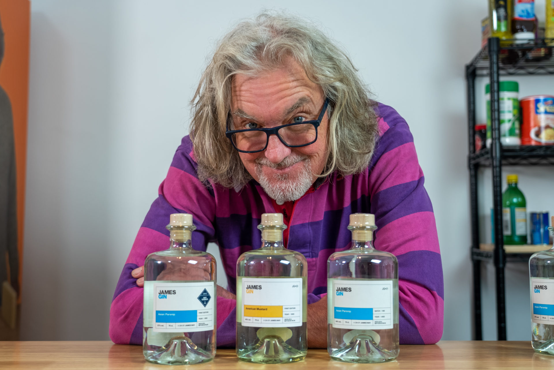
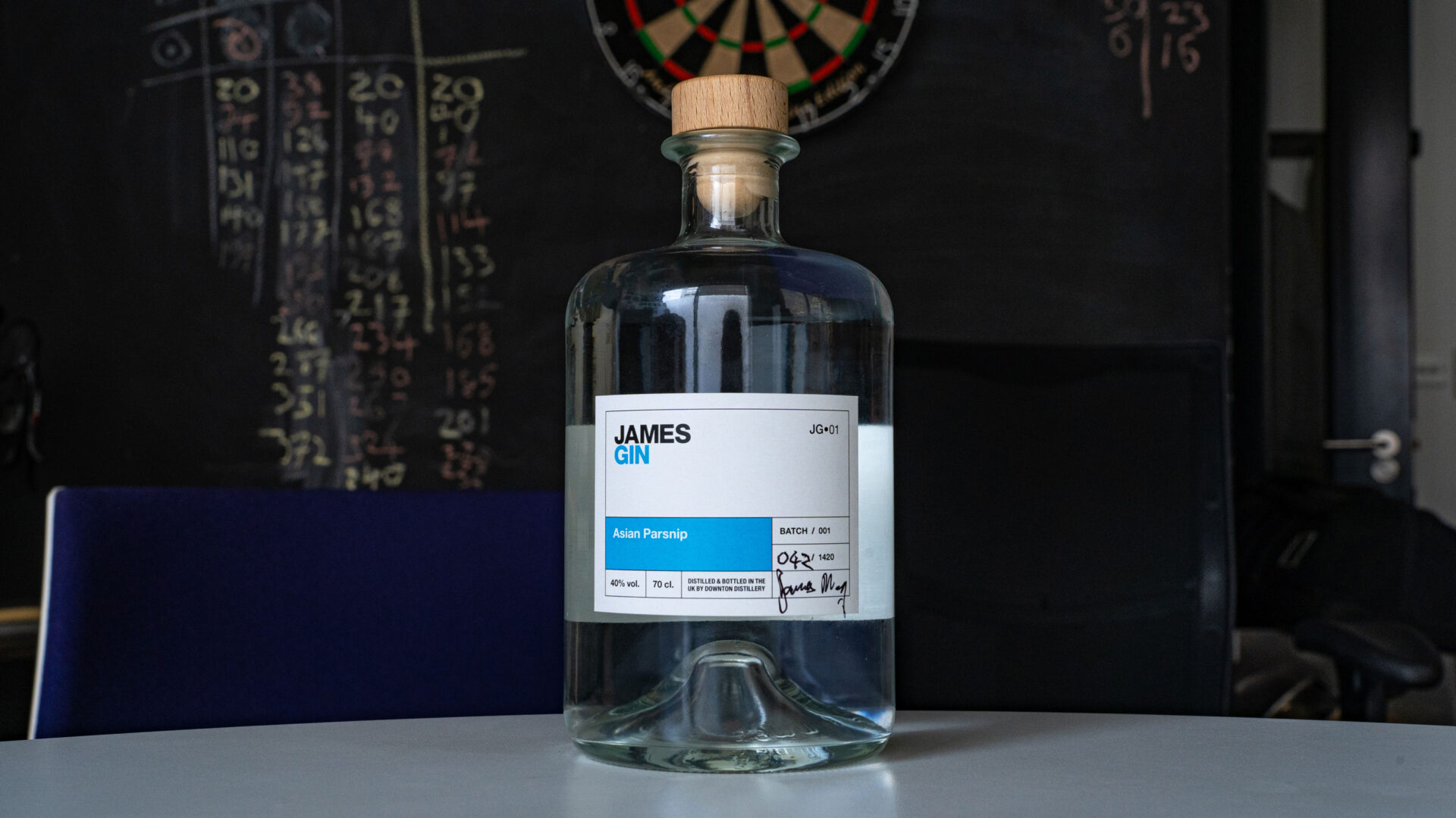
The end design was a medicinal looking route, which came from the way in which James embraced the very scientific approach to creating unusual flavours. It also incorporated a visual nod to the old Haynes car manuals, something that felt decidedly James May, and with a visual system that allows different colour schemes for any future concoctions.
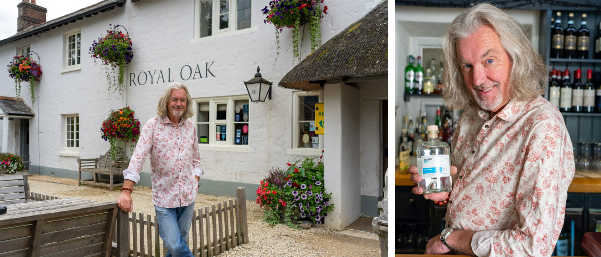
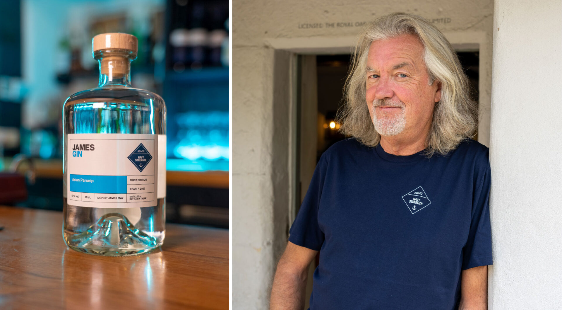
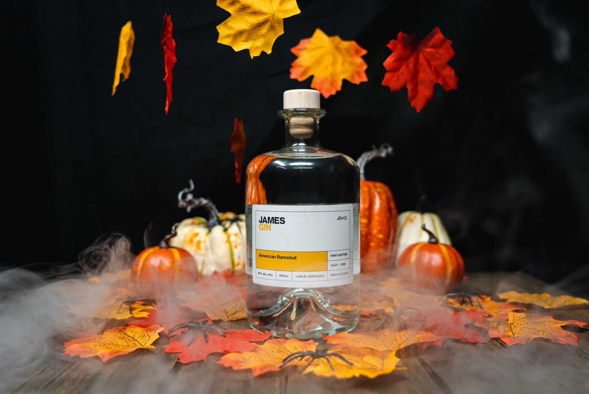
We also produced a Navy Strength version of the original ‘Asian Parsnip’ flavour, and ‘American Mustard’, which, because of various import restrictions in the US, ended up having to be renamed ‘American Ramstud’… for the export version.
Photography by Lucy Brown.